Project overview
The product
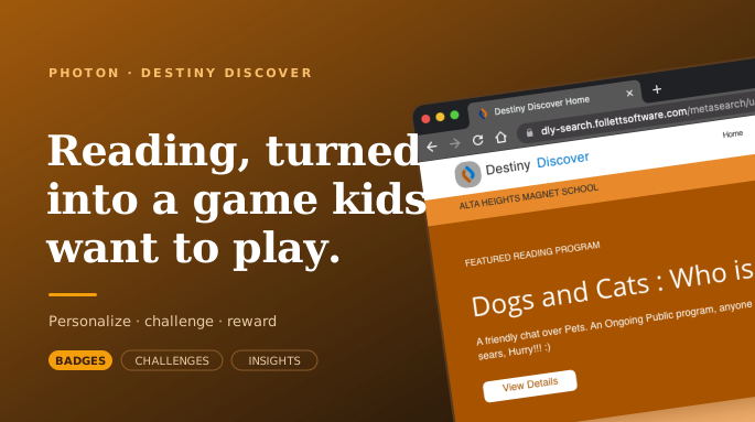
Destiny Discover is Follett's search-and-discovery front end for K–12 school libraries. Students use it to look up titles, check availability, and browse collections. Engage extends that catalog into a reading experience: it personalizes what each student sees, lets them set and share reading challenges, and rewards progress with badges and insights.
The brief
Design the Engage experiences for iPad, where students actually use the library, and keep them inside Destiny Discover's established visual language. The work spanned a personalized home, an interest survey that tunes recommendations, and a reading-challenge flow that feels social rather than assigned.
Make a school-library platform feel less like a database to query and more like a place a student wants to come back to, by personalizing it, making it social, and rewarding the act of reading.
My role
I was a UX designer at Photon, the digital product studio Follett engaged for this work on Destiny Discover. Under senior review, I contributed the screen-level flows and interface for the personalized home, the interest survey, and the reading-challenge feature on iPad.
Like much of my later enterprise work, the craft here was designing inside an existing product: reusing Destiny Discover's components and visual language so new features felt native, while introducing patterns the platform lacked: personalization, social challenges, and rewards.
A catalog gets students to a book, then no reason to keep reading
A discovery platform answers "is this book in?" well, and little else. It gets a student to the catalog, but nothing about it invites them to keep reading. The challenge was to add motivation without bolting on a separate app: engagement had to live where students already were.
A catalog that doesn't know you
Every student saw the same catalog. Nothing learned what a reader liked or pointed to the next book.
Reading stays a solo act
Reading was a private act. No shared momentum, no friendly competition, no reason to bring a friend along.
No visible progress
Finishing a book led nowhere. No reward, no streak, nothing to show for growing as a reader.
Three moves: a survey, a personalized home, a reading challenge
Three connected moves, each answering one of the gaps: an interest survey to personalize, a home that surfaces programs and rewards, and a reading challenge that makes finishing a book a social event.
An interest survey that tunes the whole experience
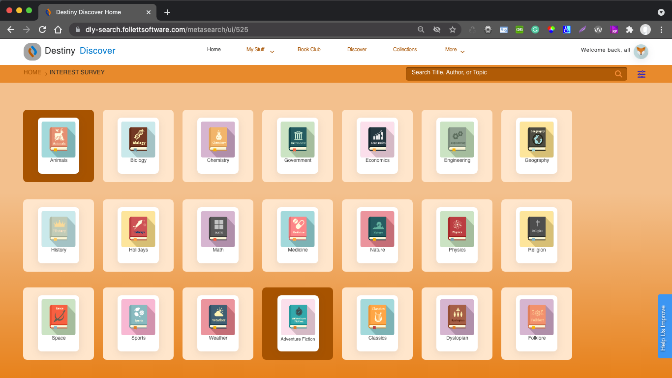
Before recommending anything, Engage asks. A grid of bold, illustrated subject tiles (Animals, Biology, Space, Adventure Fiction, Folklore) lets a student tap what they're into. It's visual and low-effort on purpose: big tap targets, friendly icons, no typing, built for a kid on a tablet, not a form-filler.
Why it matters: a few taps turn a generic catalog into their shelf: recommendations, programs, and challenges all key off these interests.
A home that rewards coming back
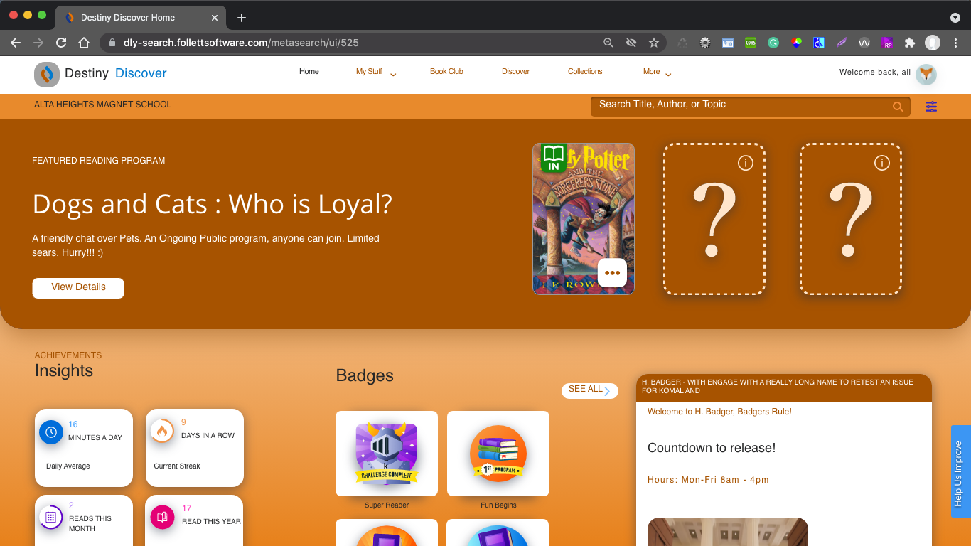
The Engage home leads with a featured reading program, a big inviting hero ("Dogs and Cats: Who is Loyal?") instead of a search box. Below it sit the motivators: insights into a student's reading, a wall of badges they've earned, and a countdown to the next release. The library starts to feel like something with news, rewards, and a reason to return.
Why it matters: progress becomes visible. Badges and insights give finishing a book a payoff, and the featured program always offers an obvious next thing to read.
Reading challenges that bring a friend along
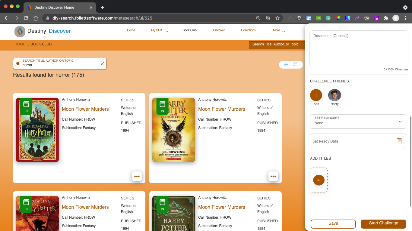
A student can build a reading challenge right from a normal search, say every horror title. A side panel lets them add titles and invite friends, so a private reading list becomes shared, friendly competition. The catalog and the social layer live on one screen. No mode-switching, no separate app.
Why it matters: reading gets social momentum. Challenging a friend turns "I should read more" into a game with stakes and a finish line.
How much friction a young user simply won't push through
Designing for kids is designing for clarity
Big tap targets, illustrations over labels, no typing where a tap would do. The interest survey taught me how far visual, low-effort interaction goes when a kid's patience is short.
Motivation is a design material
Badges, challenges, insights, and countdowns only work when they point at the real goal. Every reward was built to push a student toward the next book.
Add to a product without fracturing it
Engage had to feel like Destiny Discover, not a bolt-on. Reusing its components and color while introducing new patterns is a discipline I'd carry into every enterprise project after.
An early lesson in scope honesty
This was early-career work focused on the interface, not the full research-to-impact arc. It's where I started learning that a good case study is honest about what it is, and what it isn't.
Engage added warmth to a practical library tool. Personalization, social challenges, and visible rewards gave students reasons to return because they wanted to read, not because they had to.