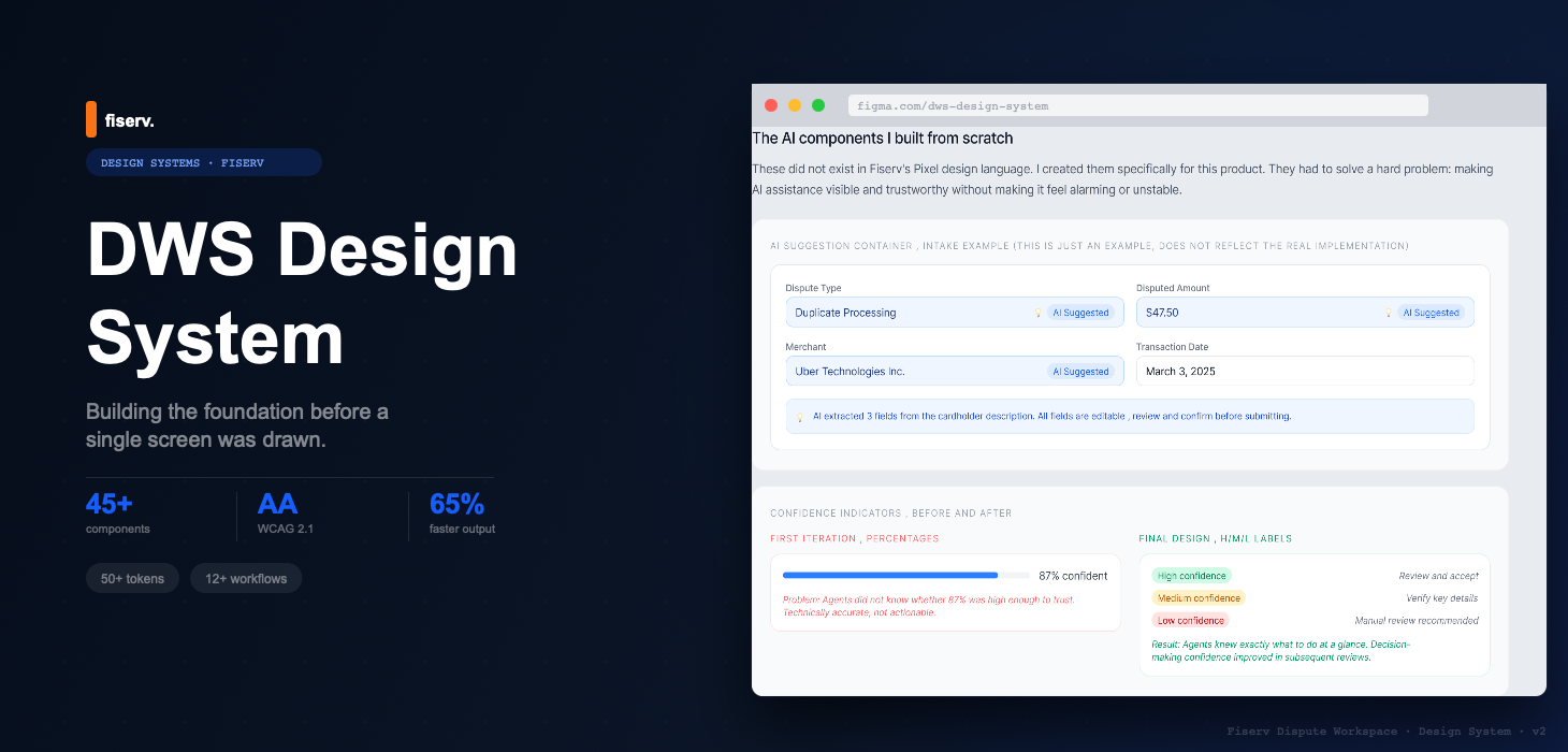
Project overview
My role
I was the UX designer. Before touching a single new screen, I needed to build the foundation the entire platform would run on. That meant auditing what existed, defining the system architecture, building components from scratch, and getting a team that had never worked with a designer to actually use it.
The impact
65% faster design output. 40% faster development. WCAG 2.1 AA compliance from day one, across 12+ core workflows.
A design system isn't a component library. It's a set of decisions made once, so you never have to make them again under deadline pressure.
What we shipped
KEY METRICS FROM THE DESIGN SYSTEM IMPLEMENTATION
A design system that AI can read too
A design system used to have two audiences: designers and engineers. Now it has a third, the AI tools that generate screens from it. Before changing anything, I looked at how teams are actually using AI with their systems this year, then started restructuring the 360 Control Figma library, built on this same foundation, so an agent can read it directly instead of guessing from pixels.
The components live in code, documented in Storybook, alongside the Figma library designers work from.
Each component has written do's and don'ts: when to use it and when not to. AI agents read those rules the same way a new designer reads the docs.
Engineers and the AI agents they work with build from this setup now.
Figma's MCP server and Code Connect let tools like Claude Code and Cursor pull the actual components, variables, and code mappings. Generated code uses the system instead of imitating a screenshot of it.
Teams keep markdown rules files and agent skills that spell out token names, component choices, and conventions. The agent follows them the way a new designer follows the docs.
Agents compare design against code, flag hard-coded values where a token belongs, and suggest layer names that match the code components.
Newer models like TypeSafe AI's Jev, in early access since September 2026, don't write text. They pick from a fixed set of typed options and return a calibrated confidence. The design system becomes the answer space: the model chooses which component or state fits, and it can only choose what the system allows.
Jev's contract is one I've already designed for. On the Disputes GPT pilot, the AI filled a fixed set of fields, said how sure it was about each one, and a person confirmed. Jev turns that pattern into a kind of model. My bet: the teams that get generative UI right will be the ones whose design systems define the choices clearly enough for a model to pick from, and whose interfaces show that confidence to the person who has to decide.
I haven’t shipped anything with Jev yet. I’m building a small live demo of it as a personal project, coming soon to the AI Intake case study.
Components and layers get semantic names that say what they are for, not what they look like. A person sees a colored pill and gets it; an agent needs to be told it's a status.
Design decisions go into structured documentation an agent can parse. It's also the fix for my own learning below: I didn't document enough of the reasoning the first time.
I'm evaluating Figma Dev Mode, the API, and MCP access so tools like Claude Code can read the system programmatically, instead of Figma being a human-only source of truth.
AI tools often pick the right tokens and the right components, then assemble them the wrong way. They fall back to generic layouts and skip the system's composition rules. Correct parts don't add up to a correct screen, so this work documents how pieces combine, not only what each piece is.
20 years of UI, zero designers
Rotating dev teams had extended the platform for 20 years with no designer involved. The result was a UI that looked and behaved differently across almost every workflow area.
What the audit found:
The problem wasn't just visual
In a dispute management platform, inconsistency has real consequences. Status colors that contradict themselves affect how banks classify cases. Broken form accessibility means compliance risk. Without a shared system, every new feature required designers and developers to start from scratch.
Tokens first. Everything else follows.
Before building a single component, I established the token layer: the design decisions that flow through every element in the system. Tokens are what make a system resilient. When things inevitably change, one variable update replaces hundreds of component edits.
One source, three surfaces
Developers were not expected to infer values from screenshots. The same semantic token drove the Figma component, the CSS variable, and the JavaScript theme object used in the application.
color.status.error--ds-status-errortokens.color.status.error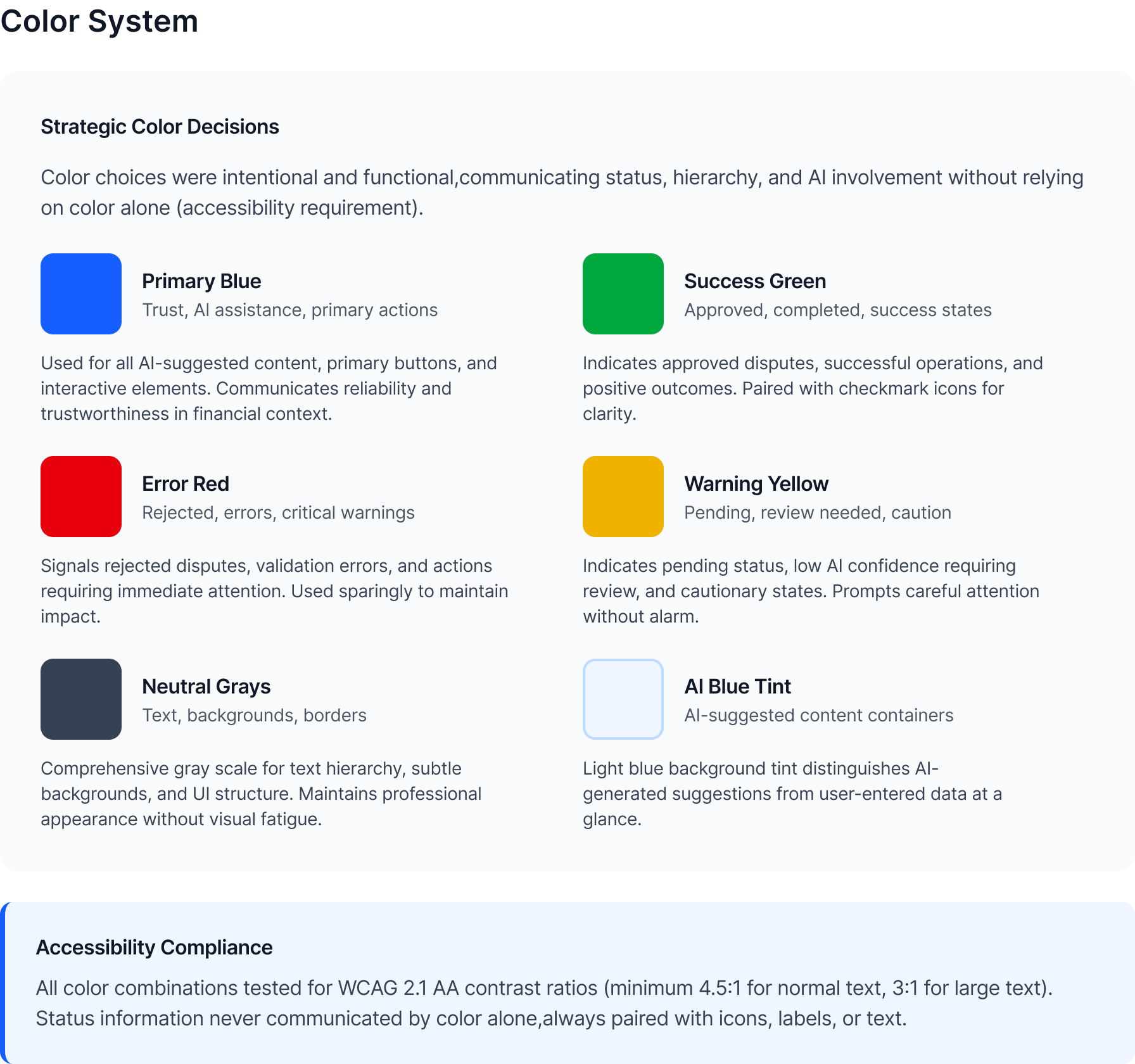
45+ components covering 12+ workflows
Every component was built for the realities of a financial data platform: data-dense tables, multi-state forms, accessibility-first interaction patterns, and AI-transparency elements that had no off-the-shelf equivalent.
Forms & inputs
Text fields, selects, date-pickers, radio groups, and checkboxes, all with focus states, error states, and ARIA labels baked in from day one.
Data tables
Sortable and filterable, with bulk-action selection, sticky headers, and status-badge integration. The backbone of every queue and list view.
Confidence badges
High / Medium / Low labels replacing opaque percentages, designed so agents see why the system thinks something, not just a score.
Alerts & notifications
Consistent patterns cover success, error, warning, and information states. Icons reinforce color, while ARIA roles announce each state to screen readers.
Dispute queue table
The table spec covered the conditions analysts actually handled: high-volume queues, batch selection, SLA urgency, sticky headers, long chargeback reasons, row actions, loading states, and keyboard focus.
Validation written as implementation rules
Inputs covered labels, helper text, error copy, disabled values, required fields, and focus treatment, so engineers could ship consistent dispute forms.
Rules for regulated AI suggestions
The system separated AI-generated recommendations from user-entered data, required confidence language, exposed source evidence, and kept override paths visible for auditability.
color.ai.surfacemerchant, amount, historyaccept / overrideMaking the system easier to use than not using it
No Storybook. No design token pipeline. Developers received Figma specs. Some had long habits of writing their own CSS. Getting adoption without mandating it was the critical challenge.
Mandating the system would have killed it
The fastest path on paper was to enforce the system, lock the components and require its use. But the developers had years of writing their own CSS and no Storybook to lean on, so a mandate would have bought resistance, not adoption. I made the system easier to use than not using it, with drop-in components and real documentation, and won adoption by pull instead of decree. Slower to full coverage, but it actually stuck.
Clear annotations on every component
Figma annotations documented exact spacing, CSS properties, and state conditions, which gave developers clear implementation guidance.
One-on-ones with senior devs
I involved senior developers in naming decisions early. Two became informal advocates who flagged off-system work during code review.
Acceptance criteria = delivery requirement
WCAG compliance went into sprint acceptance criteria. I framed it as preventing future rework, not adding new work. That reframe changed the conversation.
Before / After
What made this hard
Building a design system is a political project as much as a design project. The system has to be easier to use than not using it, or it won't be used.
Mandate the system and developers resent it as imposed process; leave it optional and nobody adopts it. No Storybook, no token pipeline to lean on.
Make the system easier to use than not: clear annotations, exact CSS values, and senior devs pulled into naming decisions. Adoption became a design problem, not a mandate.
Getting developer adoption without mandating it
No Storybook, no token pipeline. I made the system easier to use than not: clear annotations, one-on-ones with senior devs, involving them in naming decisions. Two became informal advocates who flagged off-system work in code review.
WCAG compliance in a legacy codebase
When I introduced accessibility requirements, some developers saw it as scope creep. I reframed it: we're preventing future rework, not adding new work. I ran contrast checks, wrote specific WCAG criteria per component, provided exact CSS values. The ask to developers was small.
Introducing design practice to a team that had never worked with a designer
No design reviews, no shared Figma workspace, no established process. I made the process lightweight: async Figma comments instead of scheduled reviews, acceptance criteria written in developer language. The system had to fit the team's workflow or it wouldn't get used.
Results
Measurable impact across design velocity, development efficiency, and product quality.
What I learned
Tokens first, always
They're what made the system resilient to the changes that always come. One variable update instead of hundreds of component edits. I'd do this even earlier on the next project.
Ship V1, then improve it
Perfect doesn't get used. Components that ship and get used get better through real feedback. That feedback made the system better than any amount of upfront planning would have.
Adoption is a design problem
A design system only works when teams use it. I should have documented more of the reasoning behind each decision, which would have helped future designers more than adding components.
Engineering input earlier
Some component decisions I made unilaterally were harder to implement than necessary. A conversation with the tech lead at the token-naming stage would have saved two sprint cycles.